


Analysis And Evaluation
The process begins with a thorough analysis of the provided PSD design files. The development team evaluates the design's complexity, elements, and responsiveness requirements.

PSD Slicing
Design elements are sliced and converted into HTML and CSS code. This step involves breaking down the PSD into smaller components, making them ready for web development.

HTML/CSS Coding
The PSD components are translated into HTML and CSS code, ensuring pixel-perfect accuracy and adherence to responsive design principles for various screen sizes.

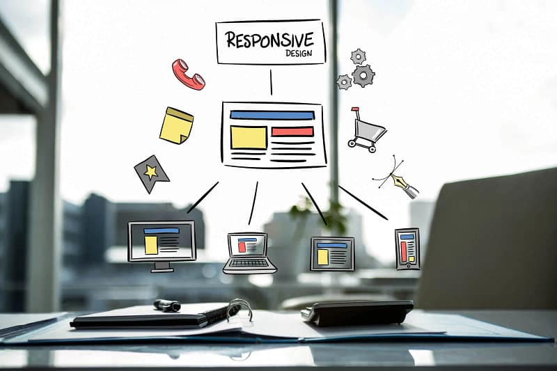
Responsive Implementation
The HTML and CSS code are structured to make the website responsive. Media queries, flexible grids, and fluid layouts are applied to ensure compatibility with different devices.

Cross-Browser Testing
The developed website undergoes rigorous cross-browser testing to ensure it functions consistently across various web browsers, including Chrome, Firefox, Safari, and Internet Explorer.

Performance Optimization
To enhance website speed and performance, the code is optimized, including image compression, code minification, and leveraging browser caching techniques.

User Testing
User testing is conducted to identify and fix any usability issues or bugs. This phase ensures a seamless and user-friendly experience.

Validate
We meticulously validate code during PSD to Responsive HTML conversion, ensuring adherence to web standards for optimal performance and quality.

Final Review And Deployment
After thorough testing and client approval, the final website is reviewed, and upon confirmation, it is deployed to the live server, making it accessible to the public.